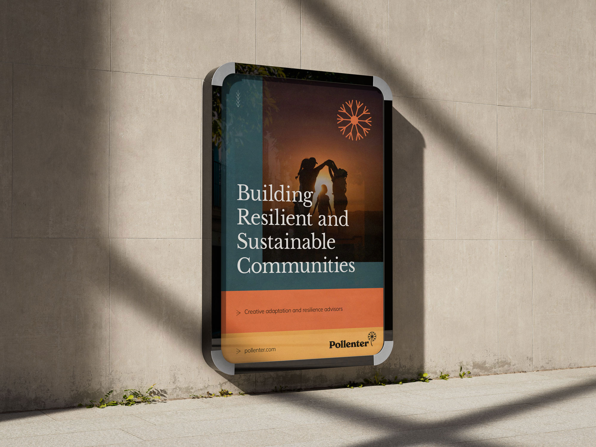
Pollenter is a consultancy helping communities and organisations prepare for and adapt to a changing climate, with a focus on resilience, sustainability and practical solutions.
Project
branding
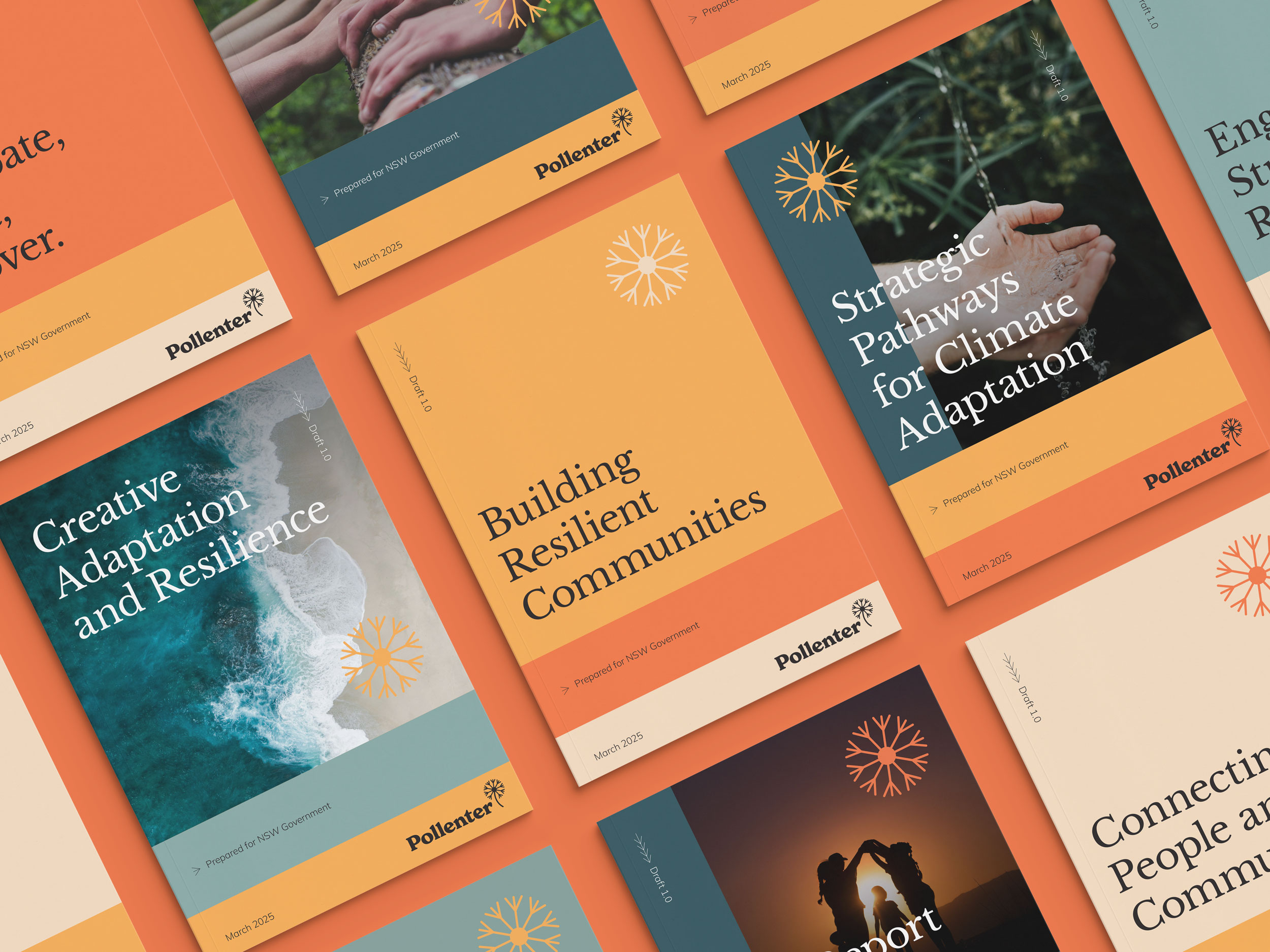
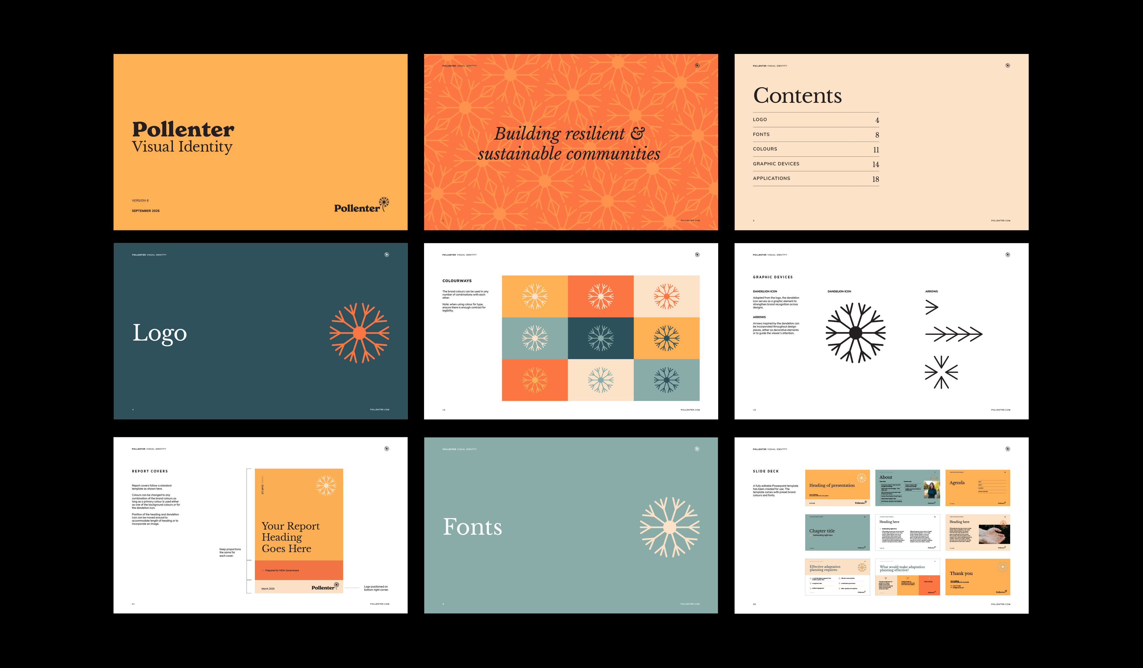
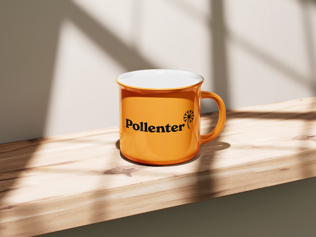
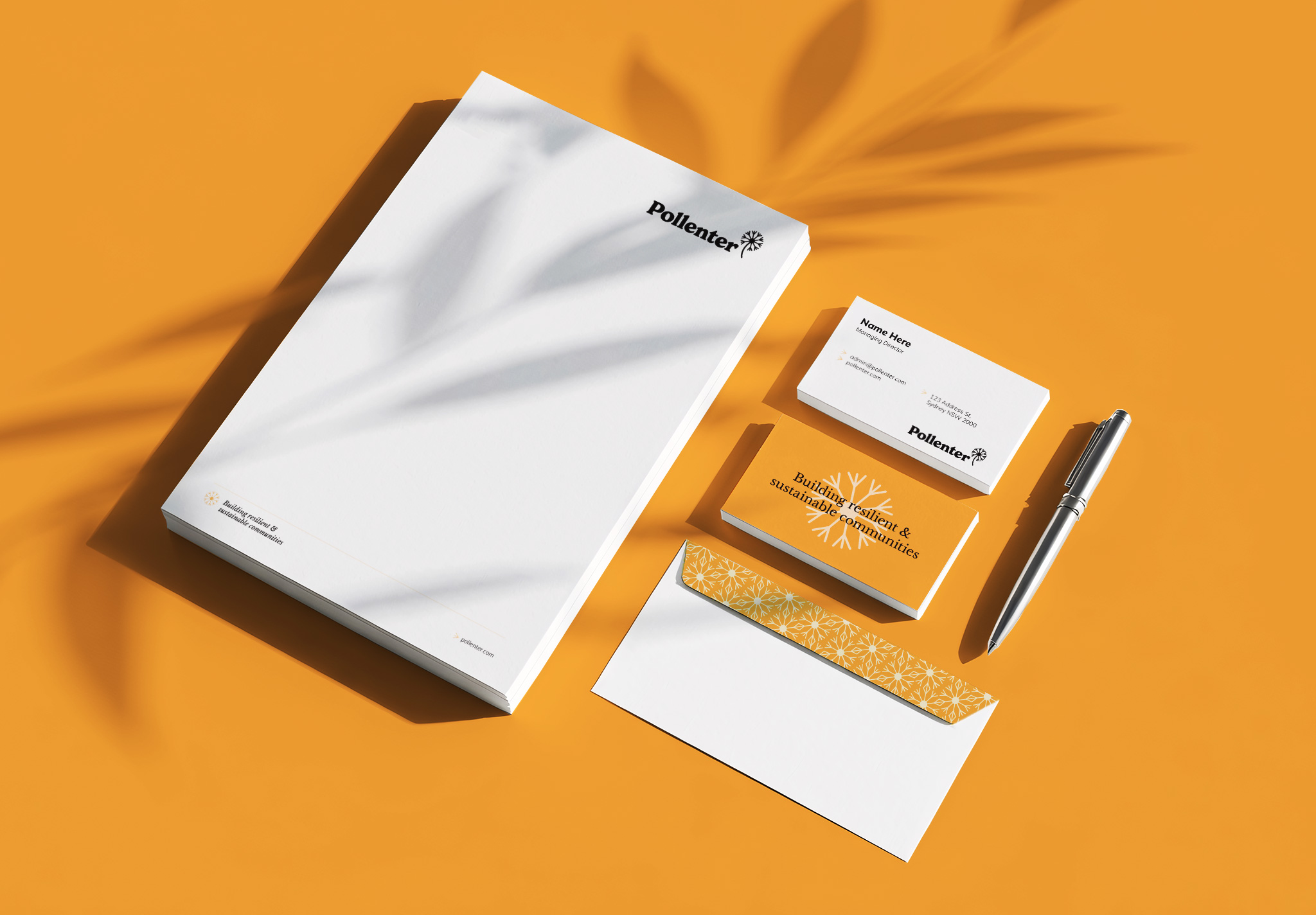
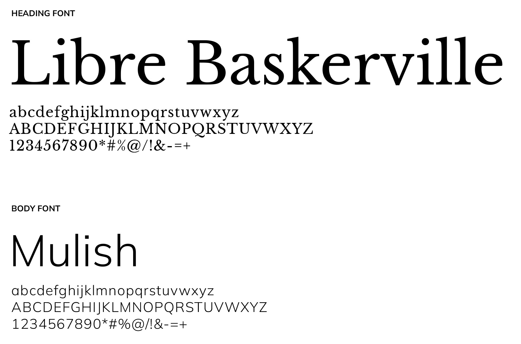
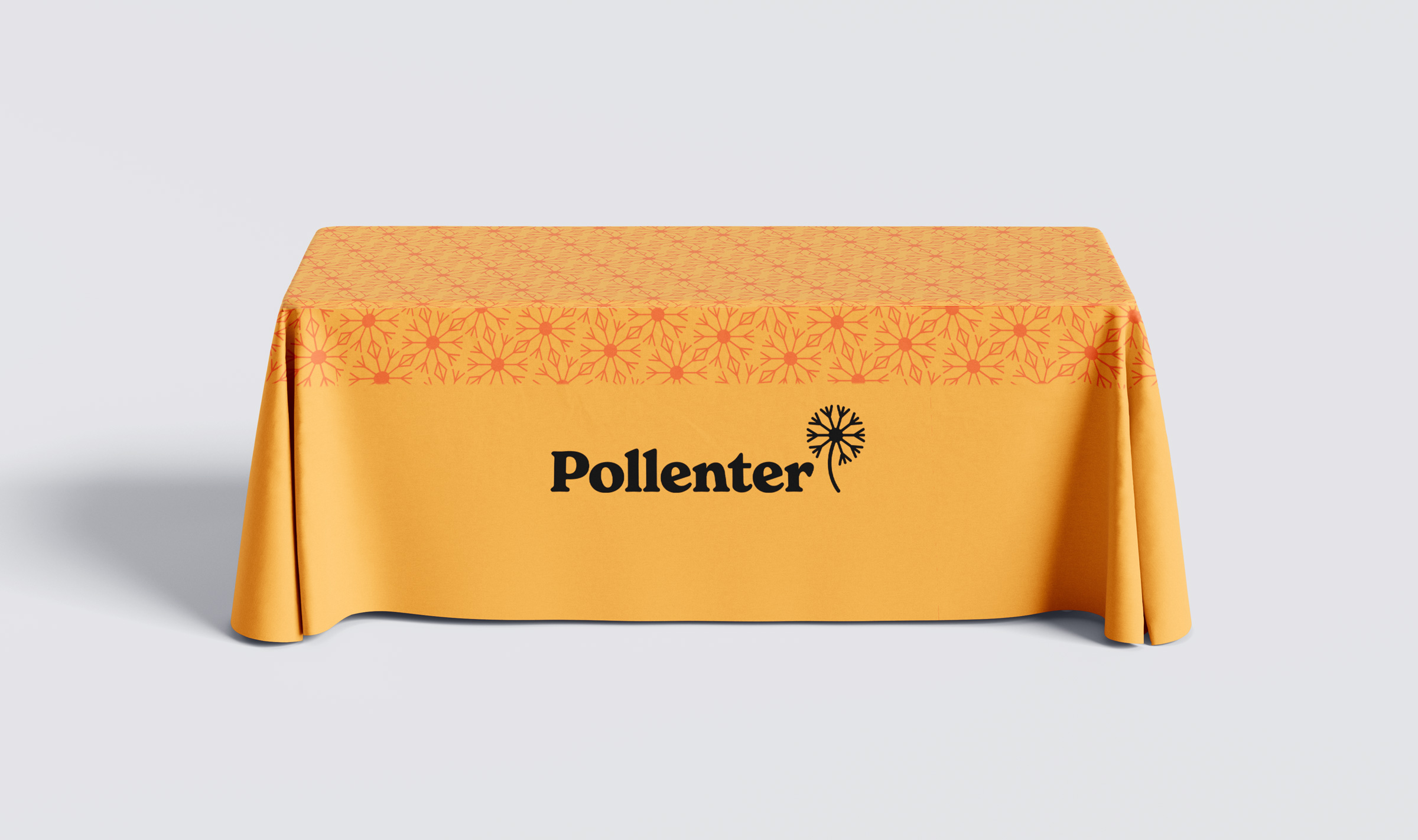
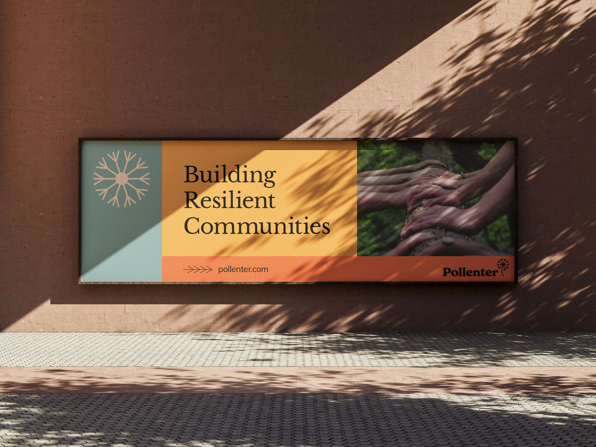
The visual identity was strategically developed to position Pollenter as a credible, contemporary consultancy while feeling approachable, human and distinctive. Inspired by the idea of pollination, the dandelion concept represents the spread of ideas, knowledge and connections. Rounded forms create an organic quality, while orange as the primary brand colour brings energy, optimism and recognition, supported by an earthy, nature-inspired palette.
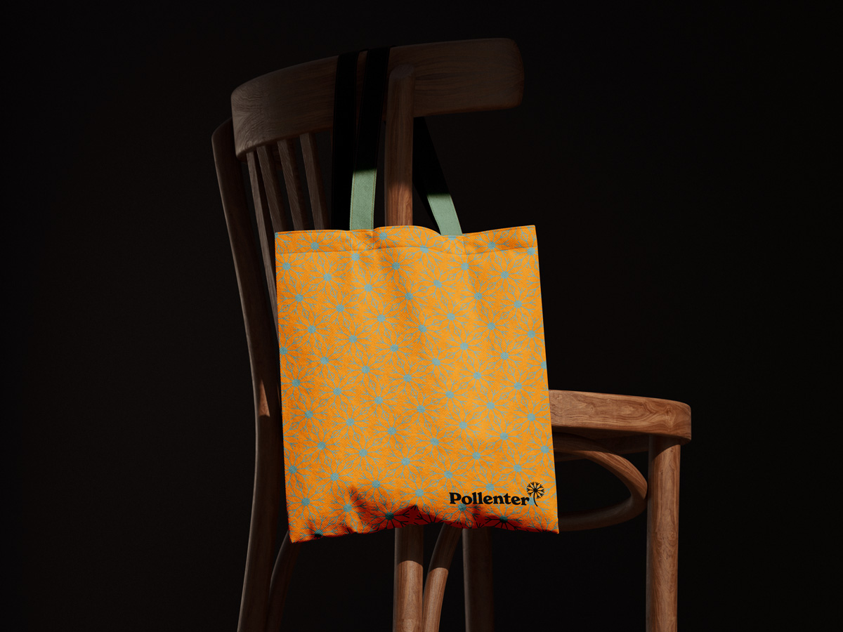
The concept was extended into a flexible visual system, with elements of the pappus transformed into directional arrows and interconnected dandelion patterns reinforcing the idea of connection. Modular layouts and adaptable graphic elements allow the identity to work consistently across formats, while easy-to-use templates enable non-designers to confidently apply the brand.